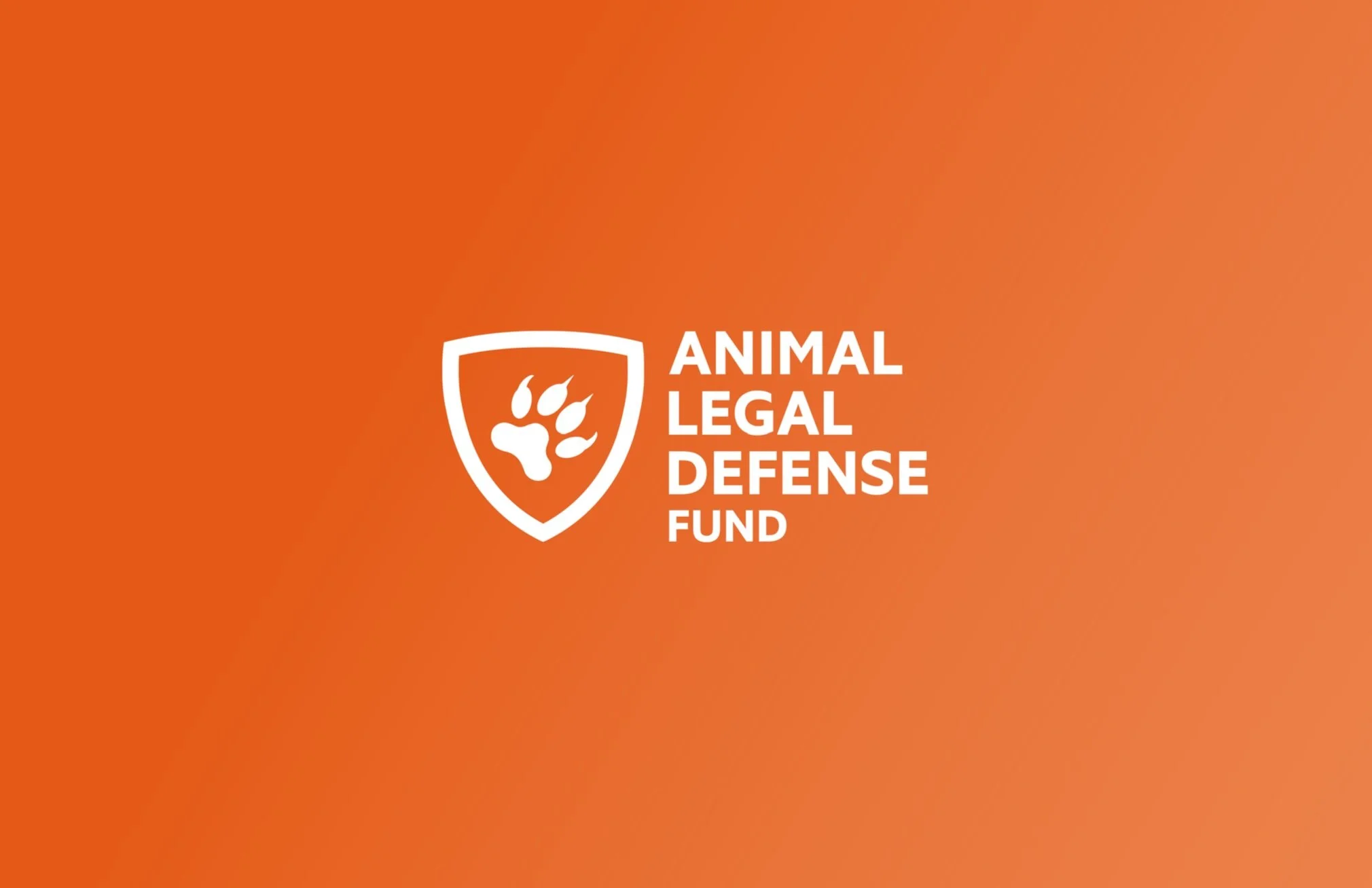
BRANDING
The Animal Legal Defense Fund is a non-profit organization located in the Bay Area, CA whose purpose is to provide justice to animals as they cannot speak for themselves. Along with my colleague graphic designer, Genesis Eliett, we researched the brand and identified key elements of what their preexisting branding was about and analyzed the organization’s speech to find their goals, values, and the message they want to convey.
We were inspired by the organization’s visual message of trying to position themselves as animal defenders by using key elements like the shield and animal references and decided to reinforce it making it stronger and cleaner. So we consider our project a brand refresh instead of a re-branding since we bring the preexisting design intentions of the ALDF (like their color palette, initial logo, etc) and give it a more contemporary, friendly, and iconic look to create a memorable impact in the audience’s minds.
We followed the design process where we tackled different levels of design decisions. We started with design thinking and research, followed by creating a brand profile and style guide, determining identity needs (logo refresh/redesign), creating print collateral and digital assets, branding a social media channel, crafting an ad campaign, and ending with the branding of a fundraising event.
This was an extensive project and an excellent opportunity to deeply understand the ALDF brand and provide practical design and brand solutions that could potentially benefit their impact on the world.
ENTERTAINMENT | ADVERTISING CAMPAIGN
A teaser poster for Disney’s animated film Frozen 2. The poster is based on the film’s ongoing theme of two sisters who are the heirs and princesses of a kingdom called Arendelle, which they now have to rule as their parents died under mysterious circumstances.
The elder sister Elsa has magical powers and she can use them to freeze anything. Hence I have used the theme of ice and snowflake. The concept here is that the magical power takes over and turns Elsa into an ice sculpture and that sculpture is slowly breaking. Through this concept and imagery, I wanted to create suspense about what will happen next.
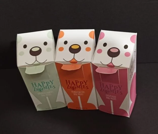
PACKAGING DESIGN | IDENTITY DESIGN
A package design for Dog treats. The design would be based on a dispenser box. I want the packaging to have a fun and informal vibe to it.
MOTION DESIGN | AWARENESS CAMPAIGN
Freedom is a short film made from still images of animals. The film tries to depict how the behavior of animals change when they are in captivity and when they are free.
This film emphasizes that we as humans have no right over the lives of animals who are equal to us. I used techniques like puppet warp to animate these still images. A parallax effect added depth and emotion in the film.
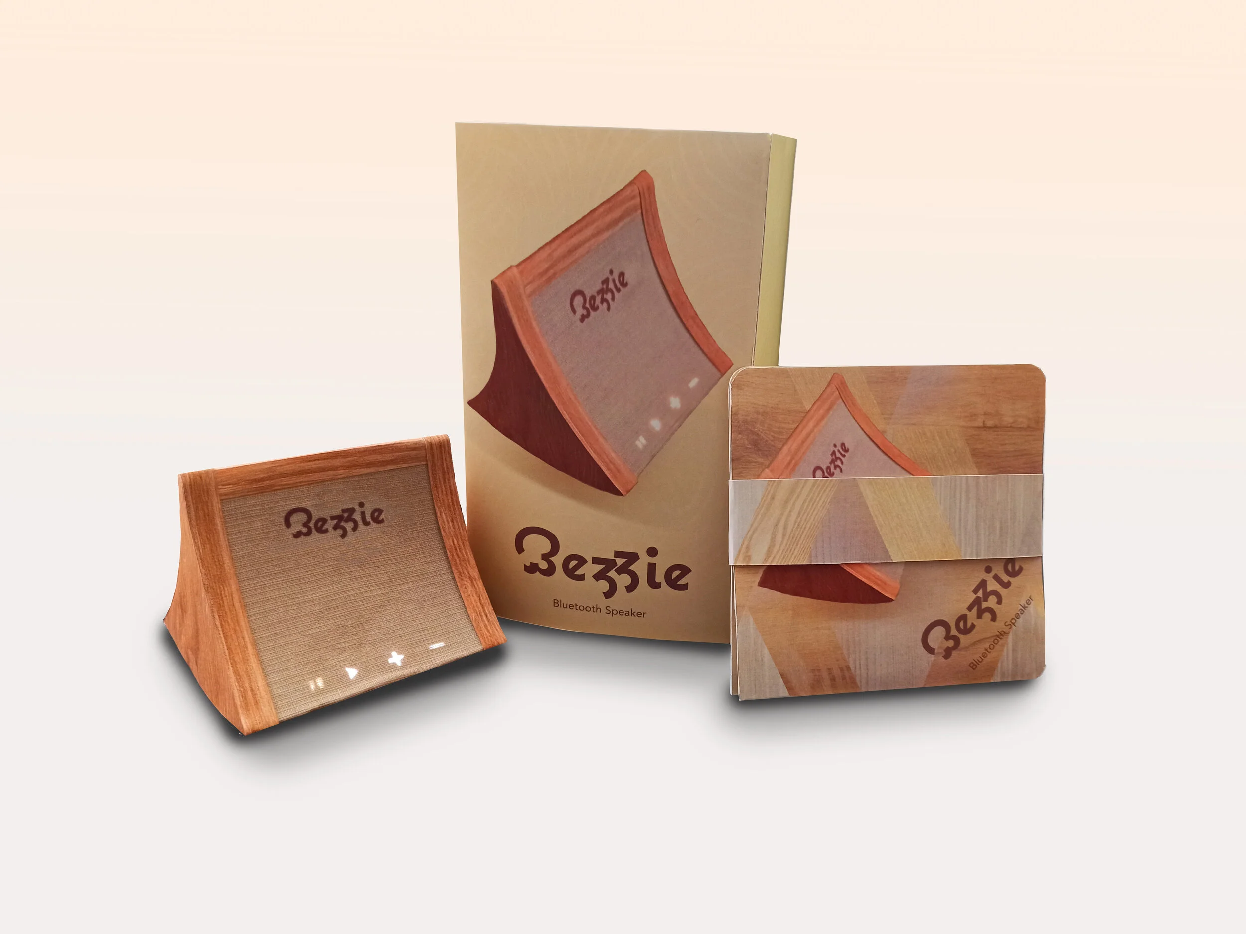
BRANDING | PACKAGING
Bezzie is a speaker concept designed completely with tactile packaging and lookbook. The word Bezzie means a best friend or someone who knows you inside out.
For this speaker concept, I researched the market and selected 4 speakers with different USP. After analyzing the market positioning of these 4 speakers, and the needs of 4 different personas, I tracked the opportunity zones and decided that the opportunity for a new product lay in the Basic/ Versatile category. So the design direction would be better quality, more engagement, fewer complications, and so on.
I decided on a soft, natural color palette, and material choice for the speaker design. I made several iterations of the logo design in different fonts that I felt were favorable for the brand. I finally decided on a stylized version of the typeface Coquette, since it looked very friendly. I sketched a rough concept for the speaker based on the concept direction and later while making the prototype, I changed it slightly to make it even more economical. The simple curved surfaces, materials like jute fabric and wood make the speaker as organic and natural and friendly as possible. The speaker has backlit control buttons that are touch-sensitive.
The packaging reflects the materials and color palette of the speaker. The packaging consists of a sleeve and an inner box, which is divided into 3 compartments. The main compartment carries the speaker, the two side compartments are for charging cable and adapter and instruction manual and important documents.
The lookbook is constructed in a way that engages the reader. It has many facets that open slowly in a different way. It depicts different interiors and home decors in which the speaker will suit perfectly.
BRANDING | PACKAGING
Shespire is a women’s walking shoe brand designed with a packing for the shoes as well as branded collateral. The word Shespire symbolize powerful women that inspire others.
For this shoe concept, I researched the market and selected 4 women’s shoe brands with different USP. After analyzing the market positioning of these 4 brands, and the needs of 4 different personas, I tracked the opportunity zones and decided that the opportunity for a new product lay in the Artistic category. So the design direction would be long-lasting, emotional appeal, value addition, and so on.
I decided on a bright, striking color palette based on the self-portrait of the famous artist Tamara De Lempicka. I made several iterations of the logo design in different fonts that I felt were favorable for the brand. I finally decided on a stylized version of the typeface Museo 500, since it looked strong and simple. I based all the packaging and the design on the shoes on simple shapes in light green with a surprise pop of red which gave it a bold look. The simple shapes make the design look bold and inspiring. I did not want to use traditionally feminine colors for this brand since I do not feel any color should be associated with gender and this will help the brand stand out among the competition.
The packaging reflects the idea behind the name of the brand. The packaging consists of a shopping bag. Inside the bag are two boxes, one consists of the shoes, and the other one holds four add on collateral to the shoes- namely a shoe stretch spray, a mini foot roller, a small pepper spray, and reflective speed laces.
The collateral box is a uniquely constructed box where there are separate compartments for each item. All the items in this package have a label with the logo. I used screen printing to print the logo on the shoes and the inner soles. I also included a travel pouch and a pair of socks with this package. I added the logo on these items also using the screen printing technique.
INTERNSHIP EXPERIENCE
Some of the projects I worked on while doing an internship at the famous J.Paul Getty Museum in Los Angeles.
The first one is a brochure for a symposium held for discussing the exhibition displaying the paintings of the famous artist Edouard Manet.
The second one is a poster series for a public program called Power Beards of the Ancient World, complementing the exhibition Assyria: Palace Art of Ancient Iraq.
The third one is a site map at the Getty Center which I worked on to update.
The fourth one is again a poster series for a public program called Making Scents of the Ancient World: Aromas of Mesopotamia Perfume Workshop, complementing the exhibition Assyria: Palace Art of Ancient Iraq.
The last one is Today at Getty flyer. This flyer displays various programs and tours happening on a particular day at the Getty Museum. I worked on the redesign of this flyer.
PUBLICATION DESIGN | TYPE DESIGN
3D type created from paper strips, also known as paper quilling, is used to make a cover for a cookbook.
I am a passionate vegan and I wanted to create a vegan cookbook cover design. I also love papercrafts and quilling is one of my favorite crafts to do. I cut out colorful strips of paper, 1 cm in width, and twisted them to form swirls. I arranged them in a design than I had sketched lightly on a paper, in and around the word “VEGAN” that I had previously drawn and colored green. This created a 3D look on the type. I added some beans and chickpeas around the type to give it a more food-related look.
This project was recommended by my instructor John Beach to be entered in the Students’ Art Show held by UCLA Extension.
BRANDING | PACKAGING
Celeste is a perfume brand for women who value passion and ambition. Celeste means heavenly or of cosmos. The design, the materials, and color palette for the packaging are selected keeping in mind the galaxy that surrounds us.
The Concept Direction, after market research, was found to be Artistic and Enriched. This meant that the packaging needed to invoke an emotional response and make the user feel the amazing presence of their inner beauty. The name Celeste also represents ambition and empowerment. A slender font was chosen to give it a more feminine look. I chose bolder colors instead of soft tints to evoke a sense of strength and ambition.
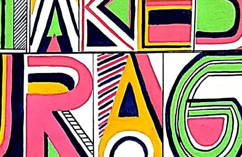
POSTER DESIGN | AWARENESS CAMPAIGN | TYPE DESIGN
Hand-painted poster series for the Go Vegan campaign.
My goal while designing these posters was to make the audience realize the repercussions of the actions they take without thinking of other creatures than themselves.
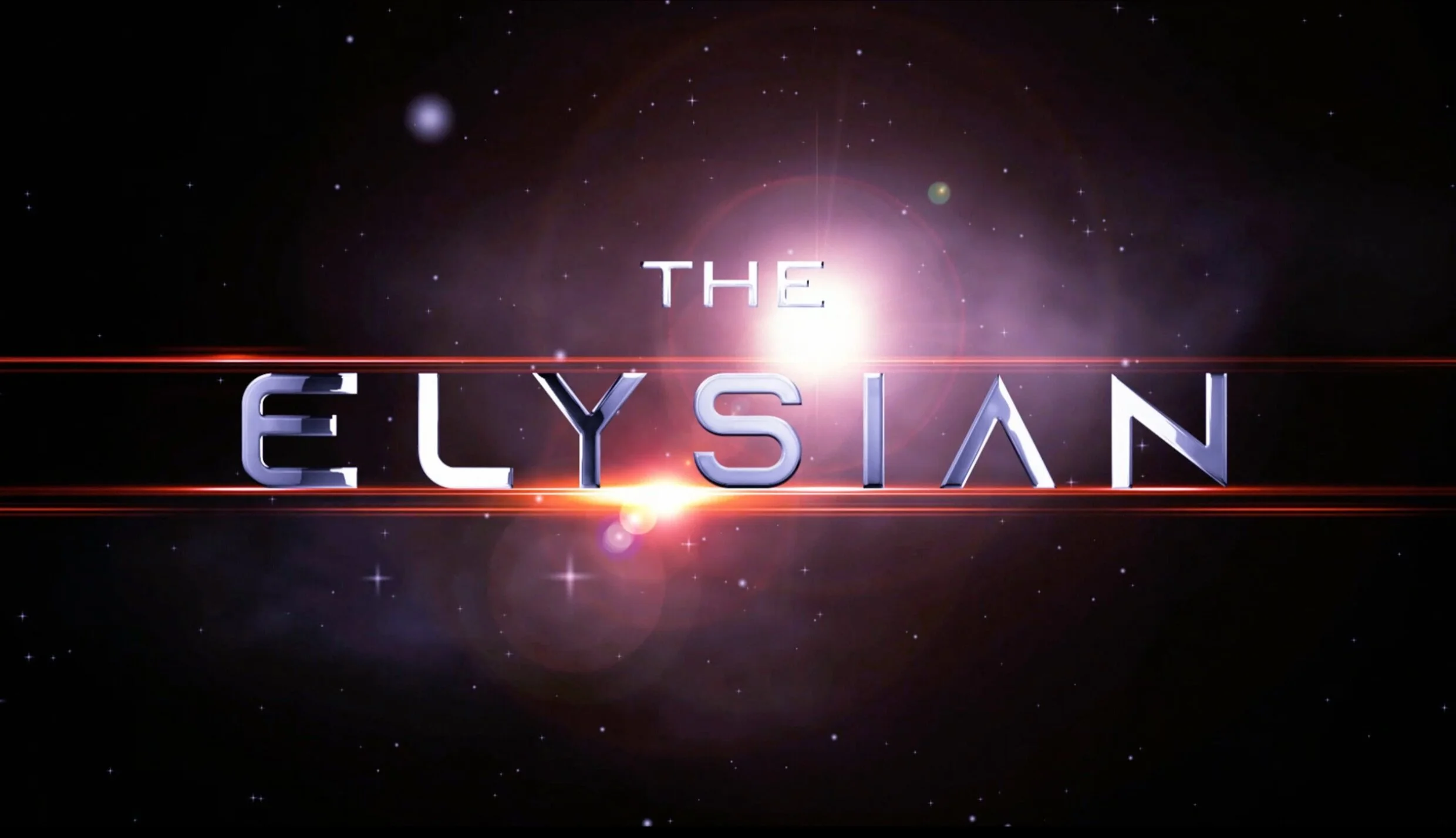
MOTION DESIGN | TITLE DESIGN
The Elysian is a sci-fi movie with a storyline based on space. This is a title sequence with credits for the movie.
For this title sequence, I wanted a camera push-through effect to maintain continuity from one scene to another. So I used camera tracking, green screen footage to create a journey through space.
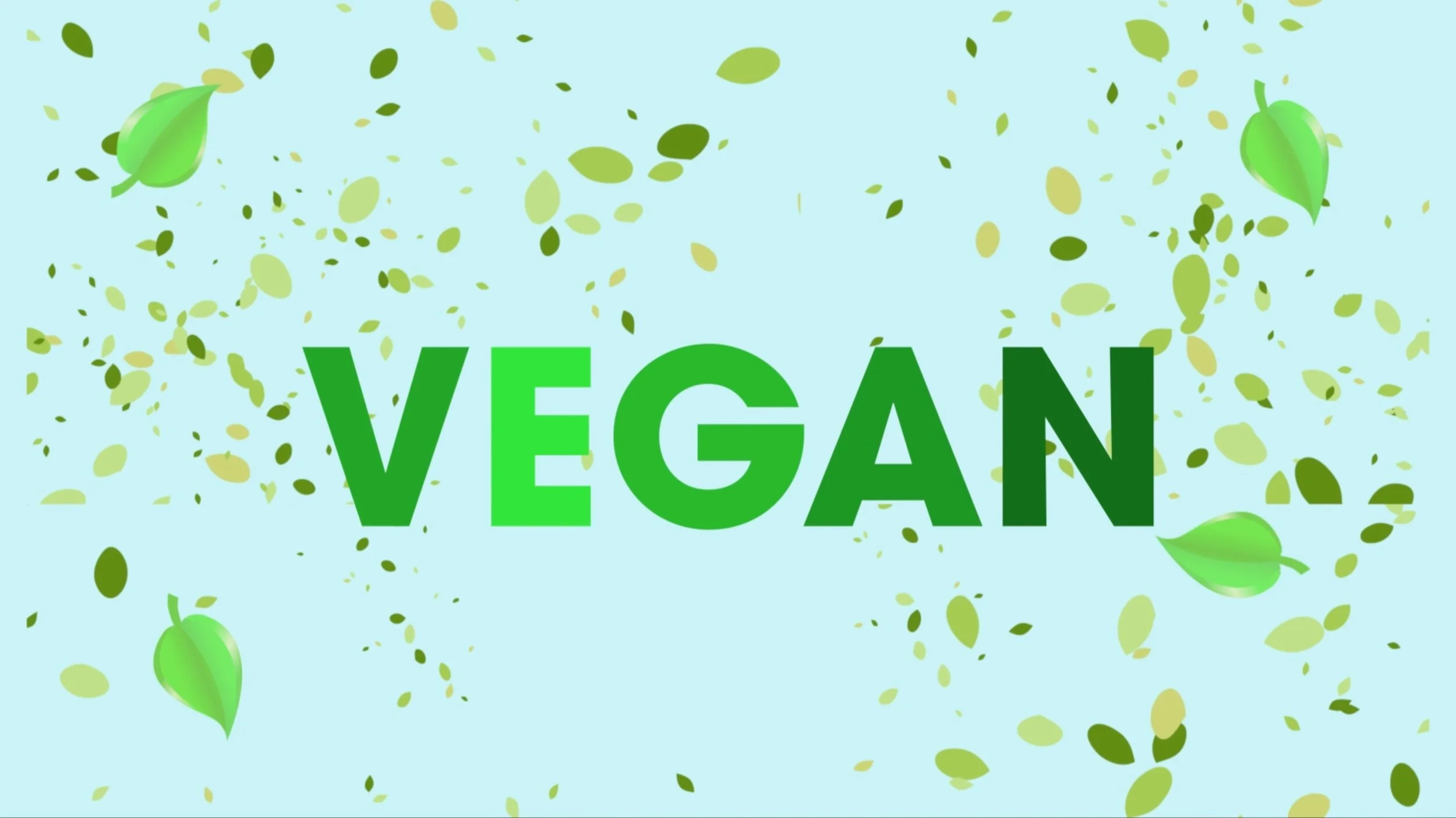
MOTION DESIGN | INFOGRAPHIC | CHARACTER ANIMATION
An Infographic video showing the benefits of Veganism with the help of a character.
I animated the character in Adobe Character Animator. The movements of limbs and face were all rigged in this program.
MOTION DESIGN
Motion graphics demo reel. It contains works using techniques like 3D camera tracking, parallax, and character animation.
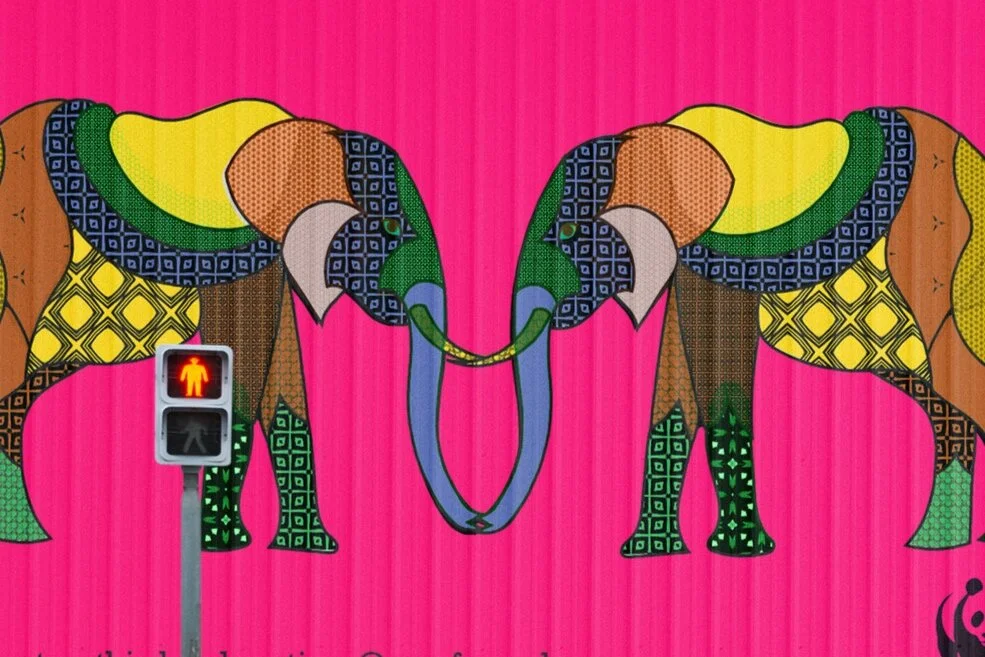
ILLUSTRATION | AWARENESS CAMPAIGN
Mural illustration for World Wildlife Fund made with patterns created in Adobe Capture. The mural depicts elephants and lemurs and talks about the issues related to these animals that WWF is working on.
This illustration was featured on Behance Adobe Capture Gallery and was awarded a badge for it.
BRANDING | PACKAGING | ILLUSTRATION
Bubbles and Giggles is a kids’ bathing product brand. The range includes bubble bath, shampoo, body lotion, and dusting powder. The robot characters were especially illustrated for this brand.
I started this process by designing the characters. The concept was to create a series of characters that kids find fascinating and get them involved in the hygiene routine. Kids love to imagine themselves as space characters and fight aliens. So I came upon this idea of space robots that look and feel friendly and colorful and almost as they could be playmates with kids. The idea was also to boost their imagination and make them feel inspired.
I used the characters in different products of the bathing range, along with a matching pastel background and space pattern in each of them.
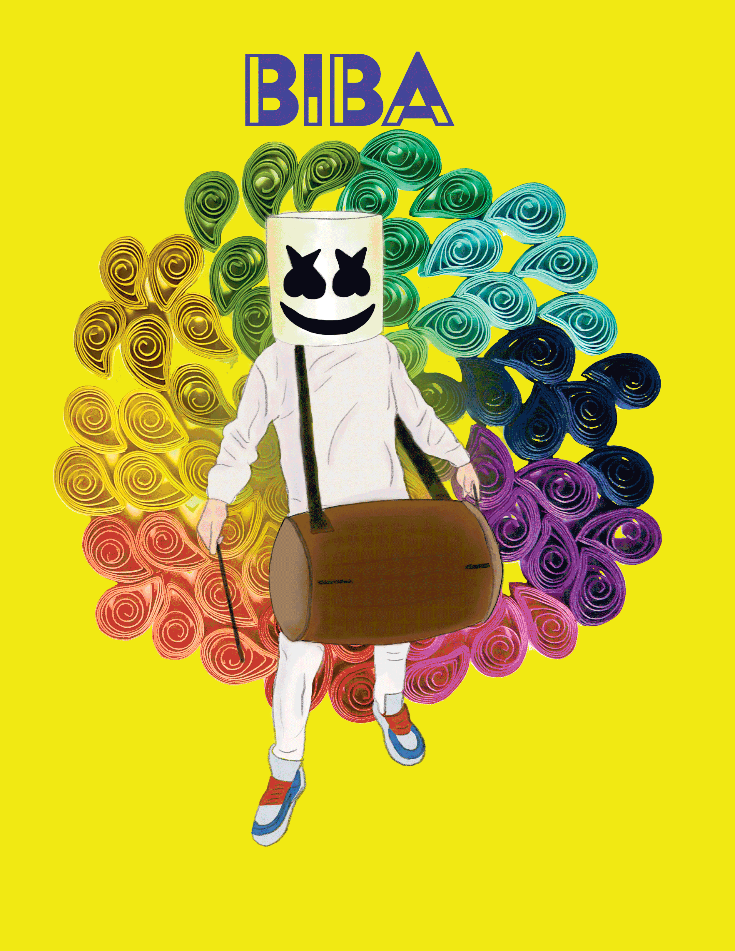
MOTION DESIGN | ILLUSTRATION
A playful gif created to promote DJ Marshmello’s new collaboration with music producer Pritam for a song called BIBA. The client wanted something that would reflect the personality of the song and the colorful collaboration between two great artists. Hence, I used colorful paper swirls to create a design for the background and used a bright yellow color under it. I illustrated the artist Marshmello playing the “Dhol” and made it a gif so it looks like he is playing it. This gif would be used for promotion on social media.
BRANDING | PACKAGING
Indiepop is a music festival featuring Indiepop music bands. This is a brand look book for the festival. The branding includes collateral like posters, flyers, t-shirts, mugs, tote bags, sunglasses, pins, caps, and mobile covers.
The branding also includes vinyl records and music CDs. The event collateral includes a map of the event location and identity passes for the crew and artist.
All the illustrations were created based on the moods of the music and a specific color palette was selected to emphasize the upbeat nature of the festival. The cover of the brand look book has a pop of glitter to add more oomph to the presentation.
TITLE DESIGN | PACKAGING
Uncharted is a PlayStation game based in south India. The story is that two women search for a lost Indian temple in an ancient forest, where they have to get hold of the golden tusk of Ganesha Statue before the antagonists find it and trade it in the black market.
I took into consideration the backstory of the game and designed a title treatment. The title is designed with a stroke over it replicating the Sanskrit script. The two strokes on both sides are also inspired by the punctuations around Sanskrit Shlokas. The stroke on top has a trident at one end which is a weapon used by Lord Ganesha.
I gave an overall corroded look to it to give a sense of the ancientness of the environment.
MOTION DESIGN
A complied video showing various scene compositions and VFX using after effects. Some of the effects and techniques used here are camera tracking and focus, color correcting, green screen footage, and keying.
PUBLICATION DESIGN | BRANDING
Upsum is a graphic design magazine aimed at an audience that is looking for the latest in graphic design. The magazine consists of various departments, featured articles, and a special feature spread.
The feature spread in the magazine is folded pages which open up to be a long full spread.
The article Internet of things has a special design which is hand made. I designed a font and traced it and hand sew it to make a typographic expression to show a connection.
PACKAGING | ILLUSTRATION
Special alphabets illustrated for flashcards for children for learning alphabets.
The alphabets are created in an isometric form to make them appear 3D. The colors that I chose for the alphabets are fun and playful to engage children and help them learn. I combined the alphabets with cute animal illustrations to make a fun learning experience for kids. The packaging for the cards has a jungle scene which would be interesting to look at.
MOTION DESIGN
Kinetic type used to make a fun video for the Song Makeba by Jain.
The goal of this video is to animate type in a way that it looks like it is dancing along with and on the beats of the song. Also, I wanted to convey the meaning of the song in some way through the type animation.
BRANDING | PACKAGING | IDENTITY DESIGN
A brand refresh for the restaurant Cafe Gratitude.
The brand refresh includes a revised logo, typography, color palette, and redesigned restaurant collaterals like business cards, menus, coasters, signage, apparel, takeaway containers, and dishes, and also refreshed restaurant interiors and website and mobile app UI.
ILLUSTRATION | CHARACTER DESIGN
Birthday cards featuring cute characters made using illustrator.
I illustrated these characters and named them fluffy monsters. I gave them cute names like “Chick Norris”, “Spidey Parker” and “Sealena Gomez”. These characters are fun and colorful. I used them on birthday cards for kids, since these characters add a story and an interesting playtime for birthday parties.
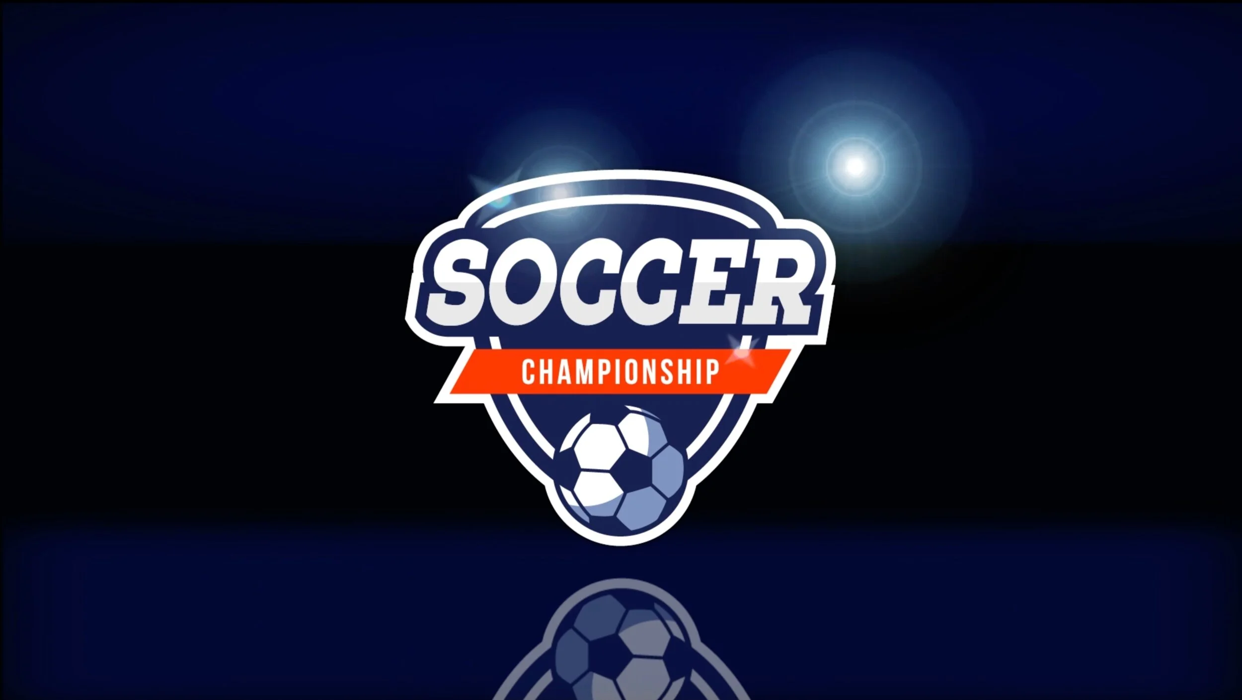
MOTION DESIGN | ADVERTISING
A sports advertisement for a soccer tournament.
I used After Effects to create different animations and lens flares. I wanted the video to have an energetic theme and have a fast pace. I used music which complimented the nature of the video. I also used camera tracking to add the logo to a stadium scene.
ENTERTAINMENT | POSTER DESIGN
Concept and scene-building posters for the animated film Kubo and the Two Strings.
Kubo and the two strings is a stop motion animation movie created by Laika Studios. Young Kubo's peaceful existence comes crashing down when he accidentally summons a vengeful spirit from the past. Now on the run, Kubo joins forces with Monkey and Beetle to unlock a secret legacy. Armed with a magical instrument, Kubo must battle the Moon King and other gods and monsters to save his family and solve the mystery of his fallen father, the greatest samurai warrior the world has ever known.
I decided to make dynamic compositions for the posters since the movie is action-packed and adventurous.
PUBLICATION DESIGN
I was inspired by Bradbury Thompson and his design style. His work is unique and bold. He uses bold typography and vintage images overlapped with colorful elements. He had a profound interest in printing and hence most of his work is in CMYK colors.
My idea was to reflect his style through a double-page magazine spread, where I intended to play with bold typography, symmetry and asymmetry, repetitive elements, and some vintage elements overlapping with shapes in CMYK and combine them with small body text to create visual contrast and texture in design. I also created a movement in the design through the use of colorful shapes which is also one of the traits of Thompson’s style.
POSTER DESIGN | ADVERTISING
A poster series for the Olympics 2028 Rowing and Crewing event that will be held in Los Angeles.
I used themes of movement, river, Los Angeles, boats, rowing, and contrast for this series.
BRANDING | PACKAGING | IDENTITY DESIGN
A brand extension proposal for IKEA, a clothing brand called Ikea Everyday.
The idea was to create an everyday wear brand from IKEA. The project encompasses the concept development, logo, and identity and its application in merchandise and environment.
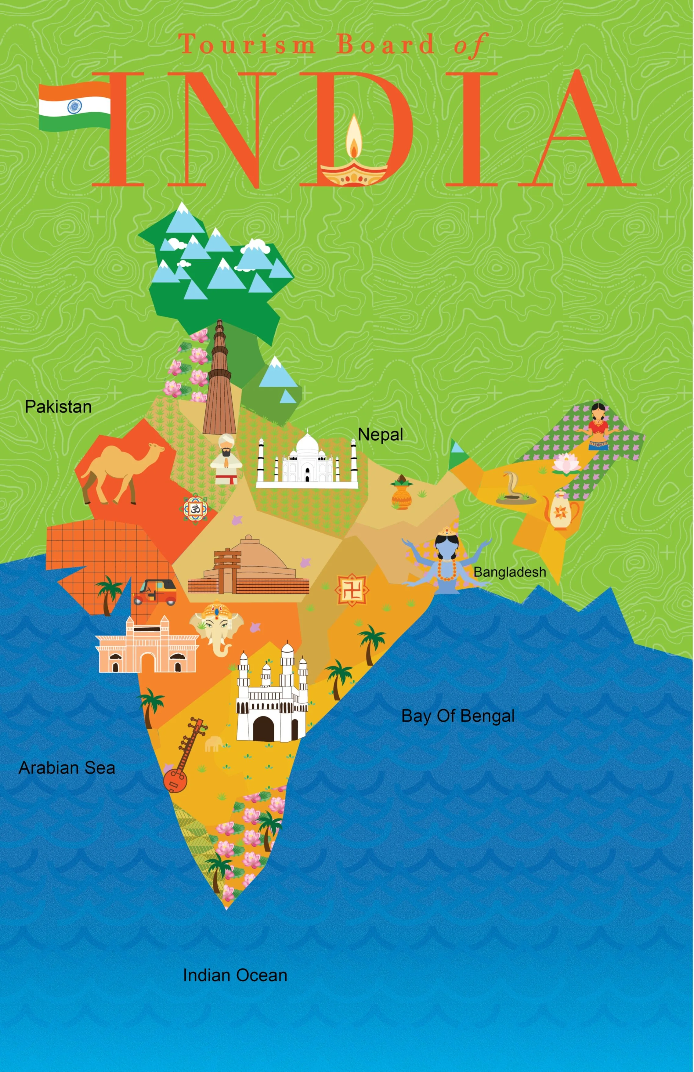
ILLUSTRATION | BRANDING
Illustrated map of India for the Tourism Board of India. The map contains various historical sites and other important geographical specialties.
I illustrated the historical monuments and various specialties of different parts of India and placed them over the illustrated map. I even added some illustrated grass, crop and flower patterns to show agricultural land in a few places.
PACKAGING | BRANDING | TITLE DESIGN
Special collectors’ edition DVD packaging for the first season of Netflix series The Umbrella Academy.
The story is based on seven special children who are adopted by eccentric billionaire Sir Reginald Hargreeves, and turned into a superhero team in what he calls "The Umbrella Academy".
The packaging is made in the form of a violin cover and consists of the iconic White Violin from the show. It also consists of the DVD of the series and a collectors’ edition comic book on which the show is based.
MOTION DESIGN | ADVERTISING DESIGN
A video compilation of different advertisements and transitions.
A commercial collection of various hypothetical ads with various effects and different styles of transitions. I also added particle effects and 3D camera movement in different parts.
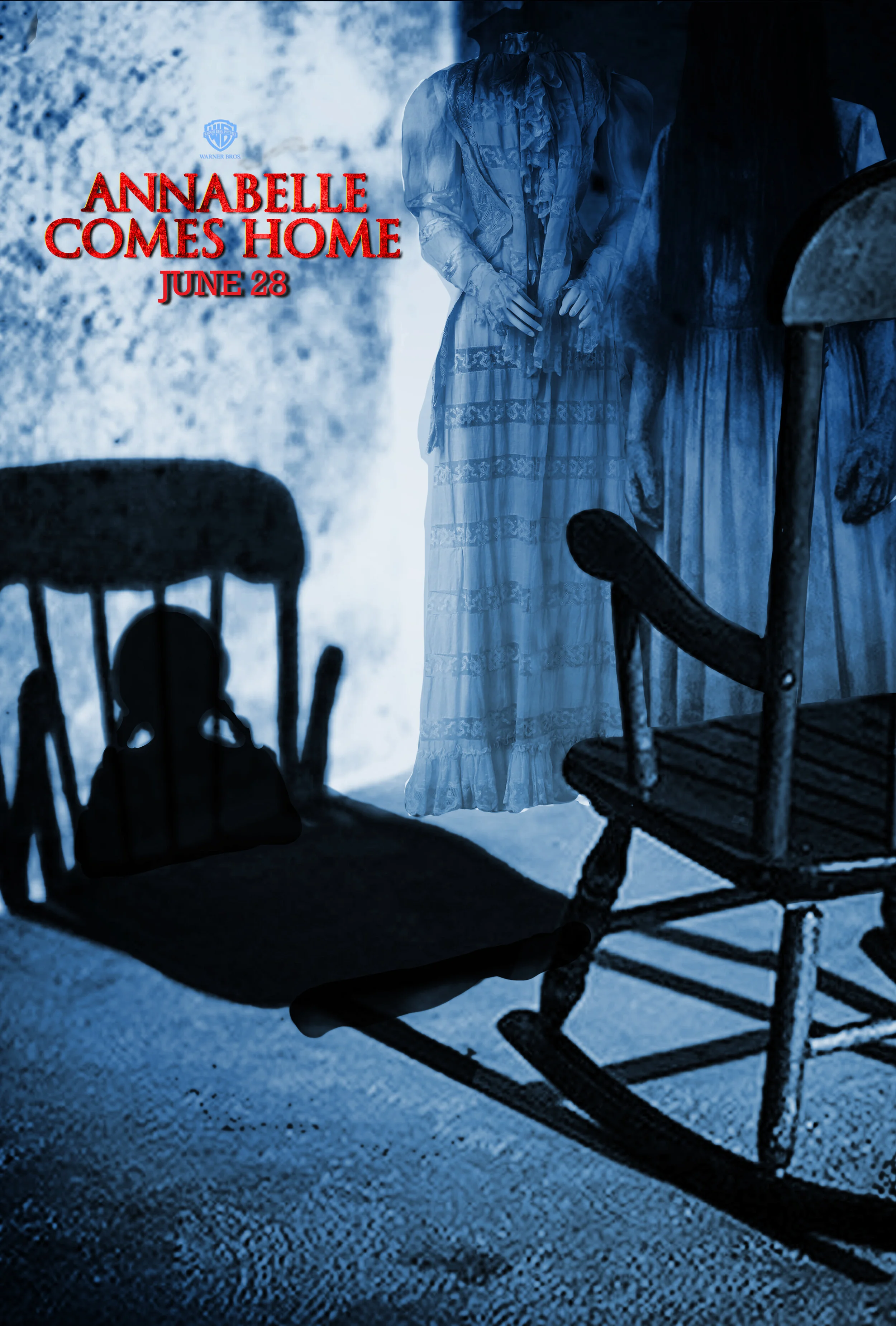
ENTERTAINMENT | POSTER DESIGN
Teaser poster and billboard for the movie Annabelle Comes Home, from The Conjuring universe.
Determined to keep Annabelle from wreaking more havoc, paranormal investigators Ed and Lorraine Warren lock the possessed doll in the artifacts room in their house. But when the doll awakens the room's evil spirits, it soon becomes an unholy night of terror for the couple's 10-year-old daughter, her friends, and their young baby sitter.
To depict the movie’s theme I composed a poster where the doll is seen sitting on a rocking chair in the shadow, but the actual rocking chair is empty. There are other spirits in the corner of the dark room. The goal was to evoke the terror of the haunted doll Annabelle.
POSTER DESIGN | ADVERTISING
A poster series for a Vintage Fashion exhibition held at the Metropolitan Museum of Art in New York.
For this series, I was inspired by Victorian fashion and Art Deco. I used images from that era and overlayed them with different elements like color, blocks and halftone dots, giving these posters a contemporary twist.
BRANDING | IDENTITY DESIGN | PACKAGING
Website pages and album covers for the artist A.R.Rahman.
A. R. Rahman is an Indian composer, singer, and music producer who works predominantly in Tamil and Hindi movies. Among Rahman's awards are six National Film Awards, two Academy Awards, two Grammy Awards, a BAFTA Award, and a Golden Globe Award. He has provided background scores for many films including Slumdog Millionaire and 127 Hours.
A lot of his music style is SUFI and hence I decided to use that theme in the designs of his website and album covers. I used soft floral backgrounds and a lilac color palette for the website.
MOTION DESIGN | CHARACTER ANIMATION
A video compilation showing 4 types of character animation.
For the first two, I used Adobe Character Animator and rigged a character’s actions. The third one is made using puppet warp, and the last one is a parallax animation made from a still image using puppet warp animation.
POSTER DESIGN | ENTERTAINMENT
Billboard poster for a fictional movie, The Girl Who Leapt to the Future, using various compositing techniques in photoshop.
This movie is supposed to be of sci-fi genre and hence I made a futuristic background from scratch using photoshop. I used glitch and glow elements to generate an interesting looking composition for the poster.
LOGO DESIGN | IDENTITY DESIGN
3D composite logo made from acrylic.
POSTER DESIGN | TYPE DESIGN
Creativity- A poster created from hand-painted typography inspired by the graphic designer Kate Moross. The poster style is whimsical and hand-built with geometrical elements and contrasting colors that grab attention.